
Brooklyn-based design agency Team have rebranded nonprofit youth-mentoring program, Empower. The rebrand signals an expansion of the organization’s initial mission, which focused on supporting young women who had experienced mother loss, broadening the organization’s reach to all children and young adults of parent loss.
The resulting brand successfully captures Empower’s expanded vision with a simple but effective shift in name, a visual identity breaks the mould of muted, somber color cues typically associated with grief and support organizations, and a new web presence that amplifies Empower’s message to grieving young people, prospective mentors, and the wider community.
To learn more, we spoke to Sam Lee, Head of Strategy at Team.
What was the brief for the rebrand?
In 2022, empowerHER received a generous donation that allowed them to expand their audience from daughters who had experienced mother loss to all children of all types of parent loss.
As the nonprofit organization set out to expand its community, they needed a new name, visual identity, and website to communicate their new offerings while reassuring their original audience that they still held the same values.
The new brand needed to be scalable, inclusive of all children, and feel truer to their mission: to empower, support, and connect all children and young adults who have experienced the loss of a parent and show them that loss is survivable.
How did the initial pitch/brainstorming phase go?
We started with an in-depth exploration of their organization, understanding their story and the people that make the mission possible. We conducted community interviews to truly understand Empower’s reach, their impact, and their vision for the future.
As a full studio, we worked closely together to translate the insights from our strategic work to design, ensuring the brand — from logo to website to name — resonated with the Empower community and their mission.
We knew the identity should feel approachable and welcoming to children without feeling childish, while also appealing to potential adult mentors and potential donors.
Describe the purpose of the brand and its target audience
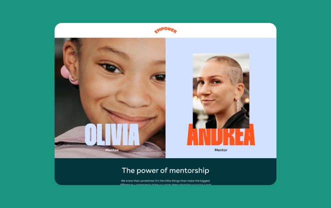
Empower (previously empowerHER) is an international organization that connects, supports, and empowers children and young adults who have experienced parent loss. The organization offers events and a one-of-a-kind mentorship that pairs children with strong, inspiring mentors who know what losing a parent feels like.
In 2013, Cara Belvin founded empowerHER to help support young girls who were navigating the loss of a mother, a challenge that mirrored her own lived experience grieving her mother at a young age.
As the organization has grown, Cara and her team have expanded their mission: today they serve any and all young people, regardless of gender, helping them cope with parent loss by connecting them with mentors who have been through similar experiences of grief and hosting events to build a supportive community.
Cara and her team brought us on board to reimagine the empowerHER brand and fully represent the organization’s expanded scope.
The nonprofit organization needed an identity — from name to messaging to website — that was scalable and inclusive, without alienating the core community that has helped make the organization who they are today.
The refreshed brand we’ve created will allow Empower to show up as the national, leading organization that they are. The brand supports Empower's mission and allows them to do what they do best: inspire personal growth and empowerment for more children than ever before.
What was your thinking behind the rebranding solution?
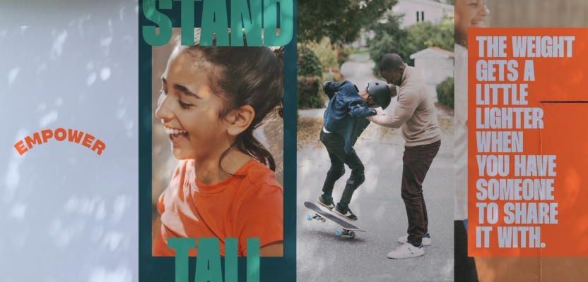
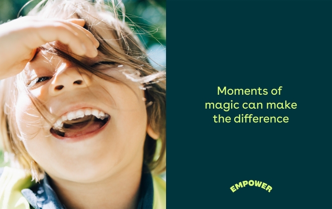
We wanted to create a design system and identity that challenged the typical imagery associated with grief — grieving people with their head in their hands, imagery that focuses on sadness or pity.
Instead, we were inspired by the organization’s message and ethos to create an identity that was bold, confident, and strong, while still mindful of the sensitivities around loss and grief. By embedding these empowering aspects in their visual identity, we mirrored the uplifting, transformative effect the organization has on children of all ages.
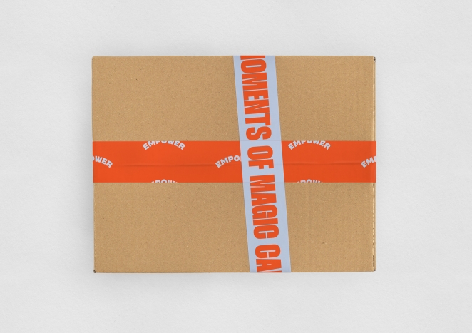
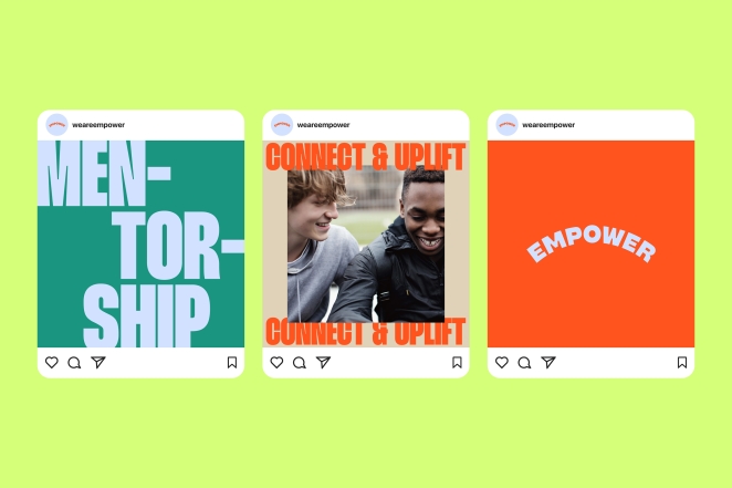
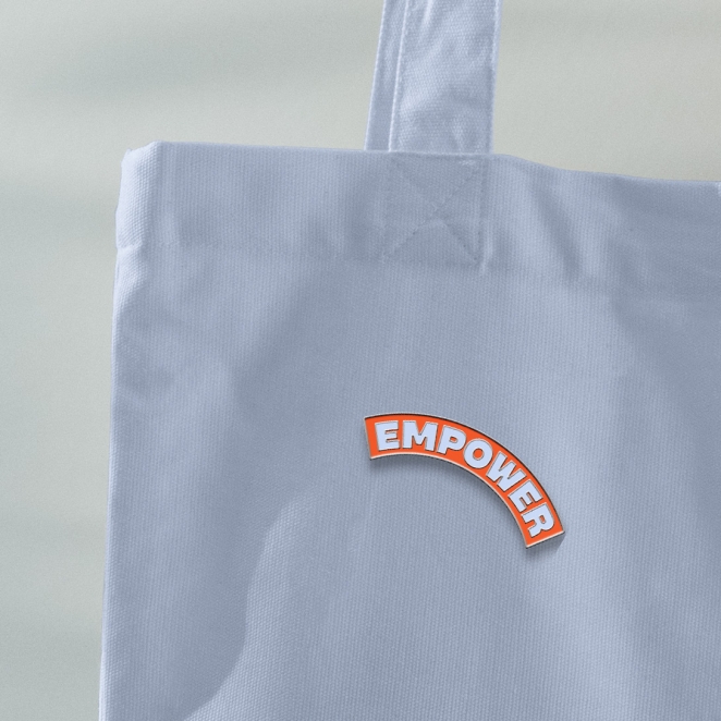
The system is built on the concept of standing taller and feeling confident, the core values of the organization and what they strive to instill in the children that participate in their programs. The new logo is a subtle arch, a visual representation of puffing up your chest. Full bleed imagery proudly takes up space, while a tall, bold typeface breaks through the grid to convey the uplifting mission behind Empower.
Empower isn’t a replacement for a lost parent, but a friendly face to help carry the weight or celebrate moments of joy. Mentors are those who can understand — and share their own experience. The strategy became about not just telling a story of surviving parent loss, but how you can thrive.
Did you learn anything new during the project?
We learned so much from everyone in the Empower community — especially the children we were lucky enough to speak with during our interviews. The composure, strength, and thoughtfulness we saw even when talking about really tough experiences was incredibly inspiring.
I think the most important lesson I was reminded of during the project is to avoid second guessing yourself or your client’s reactions. In the beginning, I wondered how bold and powerful we could take the identity and messaging, worried that with a sensitive topic like grief, we should be more reserved or careful.
But the client fully embraced some of our more visually dynamic and interesting explorations from day one and constantly collaborated with us to ensure the new brand would have the powerful impact we knew it could.
What was the biggest challenge? How did you overcome it?
The main strategic challenge was figuring out how to expand the brand from only serving girls who’ve experienced mother loss to a wider demographic: all children of all types of parent loss — without alienating the original community that made Empower the organization it is today.
The Empower community is a close-knit community bound together by a specific shared experience. That’s what makes the organization’s founding story so compelling — Empower calls it the “club that no one wants to be part of.” The mission behind the organization was very focused on individuals, particularly Cara and her personal connection to the mission and the work.
The strategy focused on the “growing pains” of getting bigger, expanding their audience while still maintaining that personal touch and close connection for a stronger brand story that is reflective of the whole community, not just Cara or any individual community members.
The solution was a brand that preserved their history and connected to their evolution. We clarified their messaging to tell a clear and uplifting story about grief that emphasized what they do. It’s not therapeutic or pitying — but instead empathetic, uplifting, confidence-building.
The organization is so unique and personal, and the new brand really captures their powerful mission and gives them the tools to tell their own story.
What kit/tools/software were used to create it?
Adobe Creative Cloud, Figma.
What details are you most proud of and why?
Above all, we’re really proud of the rich collaborative partnership we formed with the Empower team — it’s a great example of Team’s ethos that, no matter what, we are your team.
Our work with the organization was so much more than just a logo or graphic design project: we immersed ourselves in the organization and helped them clarify their mission, messaging, and marketing approach.
We collaborated closely with a range of Empower team members and forged strong relationships that we feel really shine through in the strength of the work itself.
What visual influences fuelled your solution?
We were most inspired by the organization itself, the personal story of Cara (Empower’s founder), and the mission behind their work.
From community interviews, we found that children that participated in the program all noted an aspect of hope, optimism, and most importantly, confidence. The organization helps empower them to find their voice again. From these testimonials, we were inspired to convey the purpose and the impact of Empower in their brand.
The logo distills the visual of lifting someone up in the simplest form. The system of bounding boxes and breaking out of grids supports this message of owning your own power.
We were most inspired by the organization itself, the personal story of Cara (Empower’s founder), and the mission behind their work. From community interviews, we found that children that participated in the program all noted aspects of hope, optimism, and most importantly, confidence. The organization helps empower them to find their voice again. From these testimonials, we were inspired to convey the purpose and the impact of Empower in their brand.
Visually, our design team, led by our Associate Design Director, Stephanie Zabala, explored this concept of empowerment in their creative sessions, asking the question of how to visualize hope and confidence. We looked to visual cues from other brands that felt bold and powerful to us.
This creative exercise informed our work. The logo distills the visual of lifting someone up in the simplest form. The system of bounding boxes and breaking out of grids supports this message of owning your own power.
What do you hope it achieves for the brand?
Empower’s mission is, and always has been, inspiring. The new brand doesn’t try to change the core of Empower — it embraces it and acts as a megaphone to amplify its message.
As they grow at scale, the new brand is designed to grow with them and make it easier for them to share their story.
What would you do differently if you could do it over again?
It’s not so much something we would do differently, but the stories from the Empower community are so inspiring and unique. We’d love to feature more of them in the future through custom photography, video features, storytelling, and other powerful content.
Credit list for the work?
Creative Direction: Amy Globus and John Clark
Art Direction and Design: Stephanie Zabala, Bao Hu, Ioan Butiu
Strategy and Copywriting: Sam Lee, Chelsea Sy
Logotype Refinement: Space Type
Website Development: Studio123